Today I’m writing about relatively new Power BI visualization called Synoptic Panel. It allows to draw your own ”maps” from your own images and use those ”maps” to interact with your data. I’m using quotation marks around word ”maps”, because basically your image can describe whatever you want – a car, a warehouse, a human body or custom map. I think most typical use case would be using custom map, where reporting areas are not supported by Bing maps.

My use case was to use Helsinki area great district map. Normal postal codes areas are supported by Bing maps, but Helsinki uses its own district and greater district categorization. I found this map, which includes both districts and greater districts.

Next I went to web site https://synoptic.design/ where I could upload my image.
If your image has already clear borders, that clever tool is able to auto detect those borders. I tested this with one Helsinki district. As you can see, tool created quite many border points automagically. Nice!
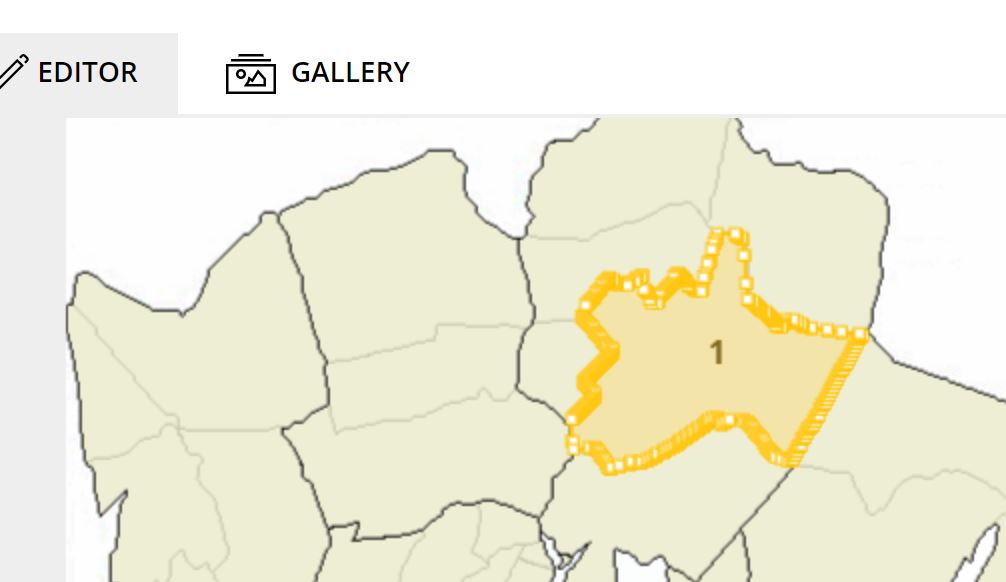
Unfortunately my requirement related to greater districts and those district borders prevented me to use auto detection. Anyway manual border creation is possible, but sometimes maybe time consuming. You can create as many border points as you like and then drag those points around to create your area. I created two areas without fine tuning.

You can and must give your areas also codes and names. Names are only descriptions, but codes are important. Those must match to codes in your data. This way you can visualize your data on your own map.

After you have finished your work (intermediate saving not possible, reserve enough time for your work), you export your new imgae to Power BI. In practise tool creates and svg-image, which you save as a file on your hard drive. Next you open your Power BI report, import Synoptic Panel custom visual if necessary and create new visual. First you need to add to fields from your data set (e.g. category and measure) and then visual shows you an option to choose your imgae from Local maps or from gallery.
As a measure I used population of greater district and additionally used number of 0-6 years old as status measure. With status measure I can use different color coding for each area. And here is end result. I can add additional visuals to show detailed data for selected area and normal interactions between visuals work.
Pretty nice visual I would say (not my, but overall)! Next I will either finalize my Helsinki district and greater district maps or wait that some hardworking person would do that for me. You can contribute the society by publishing those maps created by you to the gallery and everybody can start using those then. After that I can start publishing nice Helsinki statistical information using this new map visual!